Wychwood. Celebrating the mythical characters of its forest location.
- Branding
- Packaging
The challenge
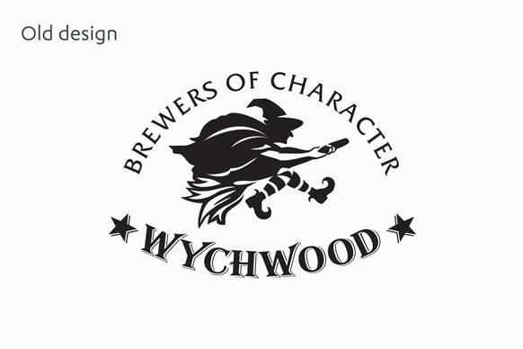
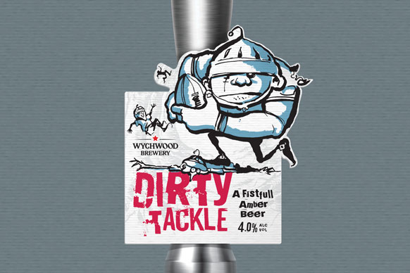
Alongside the rebrand of the legendary Hobgoblin, we were tasked with reviewing the Wychwood Brewery brand identity to create a new look and feel for its portfolio of products, including re-designing the brewery’s logo. With a desire to establish an obvious link between each product and Wychwood itself, the existing character-led range – a mix of mythical and fictional characters – didn’t fit the overall strategy of the brand.
The solution
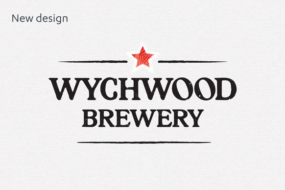
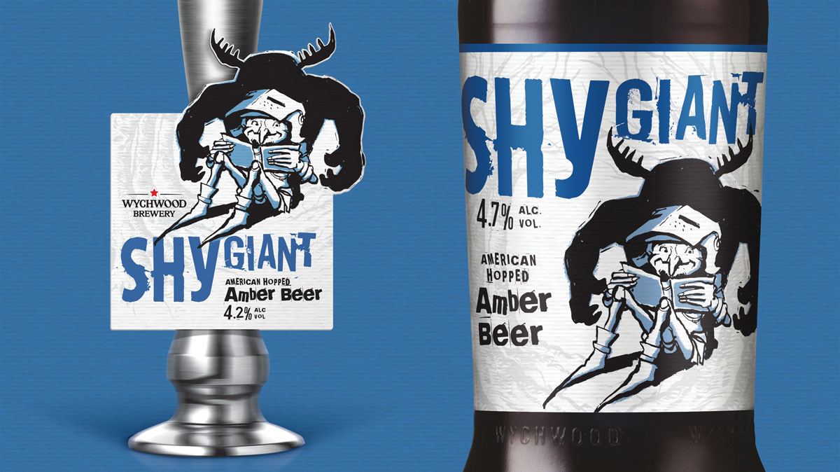
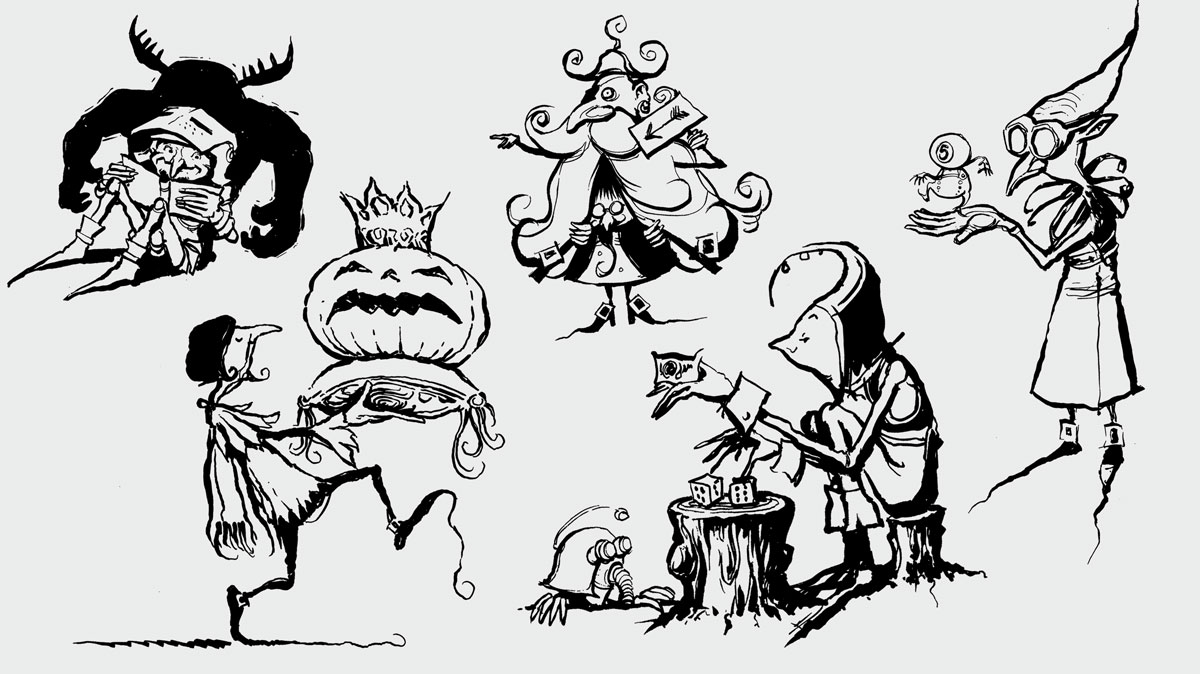
We worked closely with the Marston’s marketing team to build a clear visual strategy. We removed any ‘witchcraft’ elements from the brand and created a strong link with the Wychwood Forest in Witney, where the brewery is located. We retained its long-standing mythical associations by creating a unified style of characters that tell the stories of the forest creatures using a loose, sketchy illustrative style. The new look and feel adds a modern ‘twist’ and uniqueness to the craft products, whilst the forest background references and mythical associations retain the connection with the Hobgoblin master brand.