Pyrex. Premiumising an already-admired household brand.
- Branding
- Packaging
- Literature
- Brand guidelines
The challenge
When Arc International Cookware added the Pyrex brand to their portfolio, alongside their 'everyday' Arcuisine range, they required a review of their range structure and positioning strategy, to ensure they were targeting a younger, more style conscious consumer.
The solution
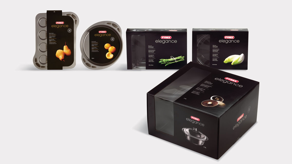
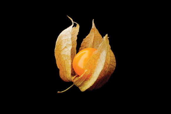
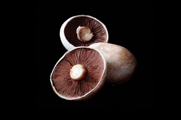
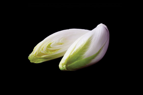
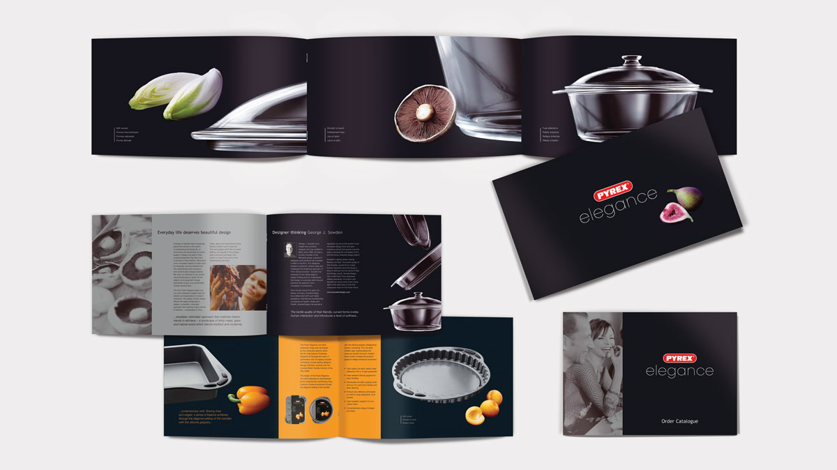
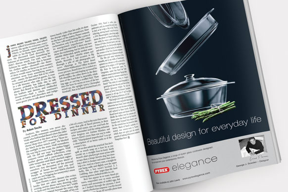
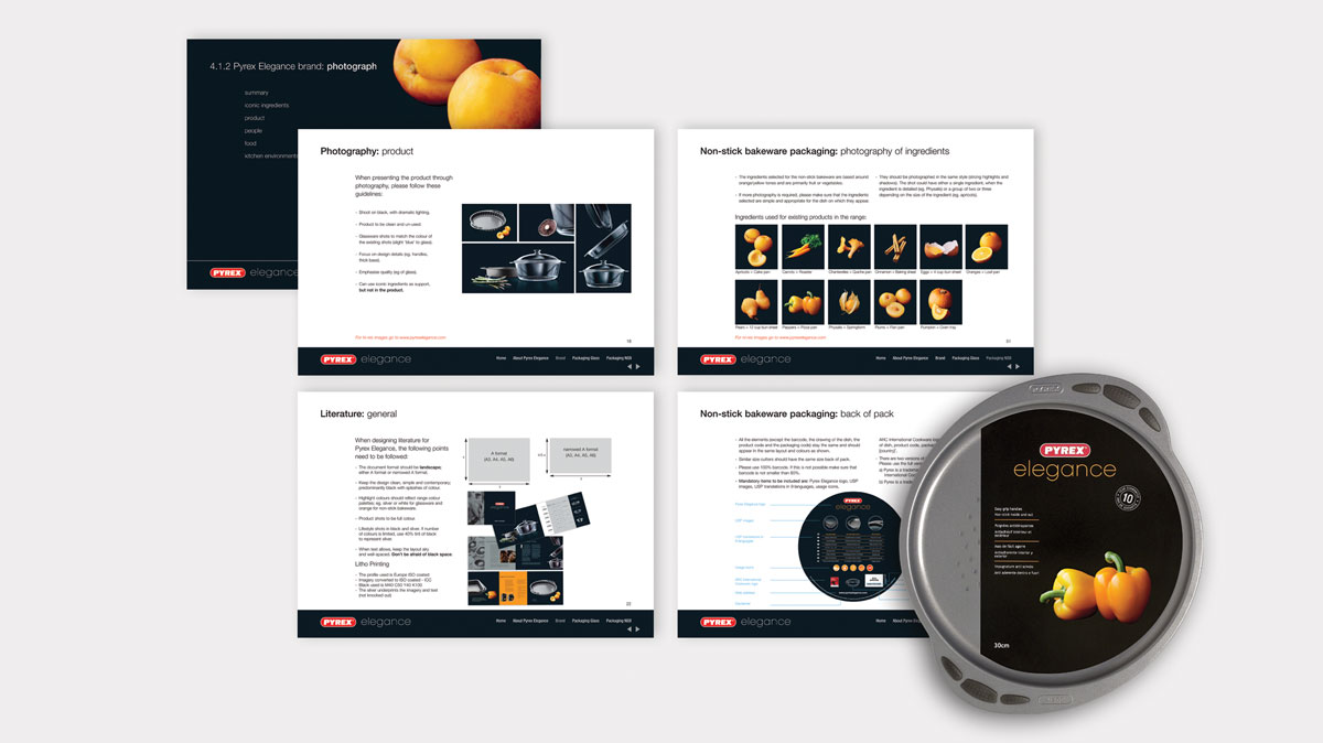
Following extensive market research, we recommended a 'good, better, best' structure, re-positioning the Arcuisine and Pyrex brands as 'good' and 'better', and creating a new concept for the 'best' position…Pyrex Elegance. The new premium range moved away from the green and red colour palette, long identified with the Pyrex and Arcuisine brands, focusing on black and silver to give a beautifully sophisticated and elegant feel. Specially commissioned daylight photography of ingredients, shot against black, added a splash of colour to the different ranges. The new brand was implemented across ranges of glassware and metal bakeware packaging, with a core suite of support literature and catalogues, produced in multiple languages, supported by a global press ad campaign and point of sale.