Pegasus Health. Leading the field in equine nutrition.
- Branding
- Packaging
The challenge
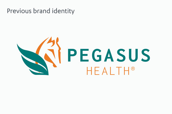
Pegasus Health is an equine supplement brand that had been around for many years, but in more recent times, its credentials had been somewhat diluted as a result of a name change. Recently acquired by equine feed specialists, Keyflow Feeds, the brand’s new owners were keen to reinstate Pegasus Health’s original name and build upon its credibility as a strong, dependable brand that reflected its heritage and built trust. In a cluttered market, Pegasus Health needed a new brand identity and packaging design that would help them stand out from the crowd, essentially whipping the brand into shape and bringing it back to its ‘best’, alongside an ambitious commercial goal to increase the current turnover tenfold.
The solution
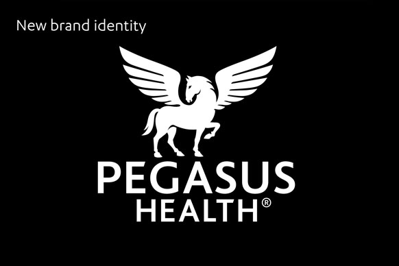
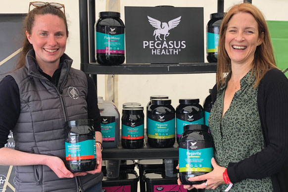
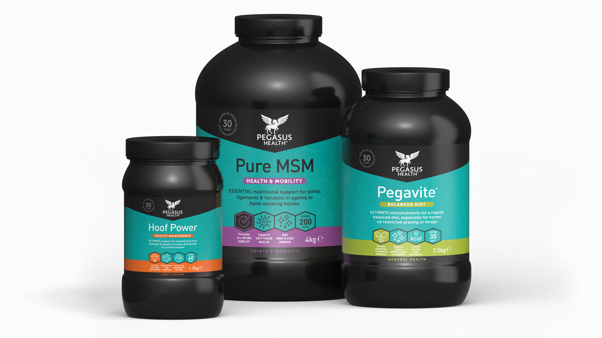
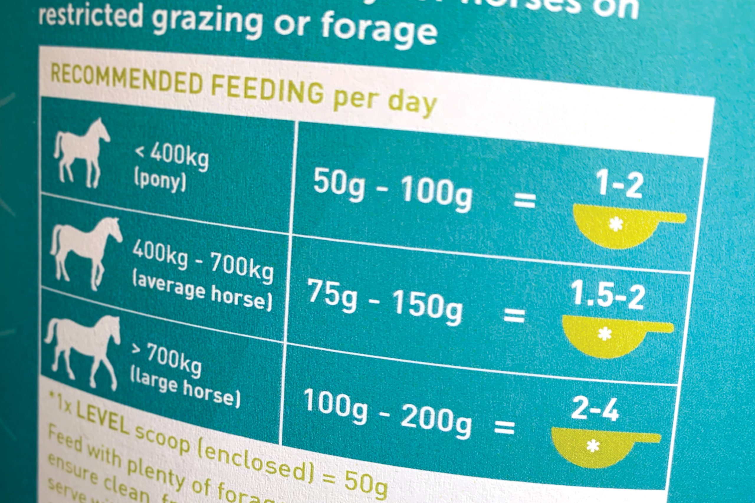
Building on the symbolism of the mythical winged horse, the new identity represents strength, confidence and pride, giving prominence to the ‘Health’ element of the name to clearly differentiate the brand from others within the market. The addition of a ‘Trusted in equine nutrition for over 30 years’ roundel also adds credibility to help build trust from their audience. With the potential to add numerous products in future, particular focus was paid to the range architecture and the need for quick identification by product type and benefit. Using a combination of colour to segment a total of seven different categories plus a product ‘lozenge’ and benefit icons to differentiate within each of those categories, we created a hierarchy of information that made purchase decisions quicker and easier. That, along with re-worked back-of-pack copy and dosage infographics, provides reassurance to customers that they are buying the right product for their horse’s needs.