Marston’s Brewery. Gaining the attention of the next generation of drinkers.
- Branding
- Packaging
The challenge
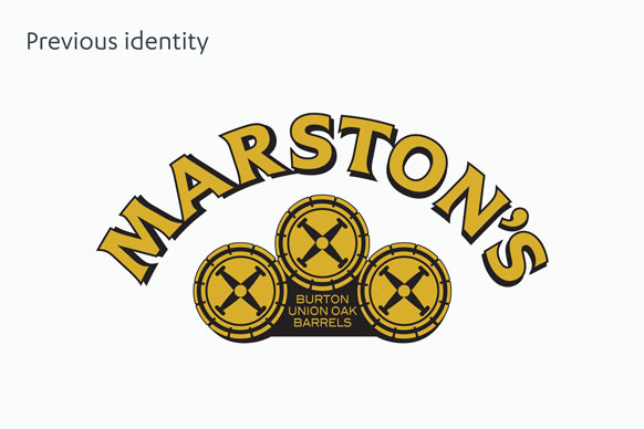
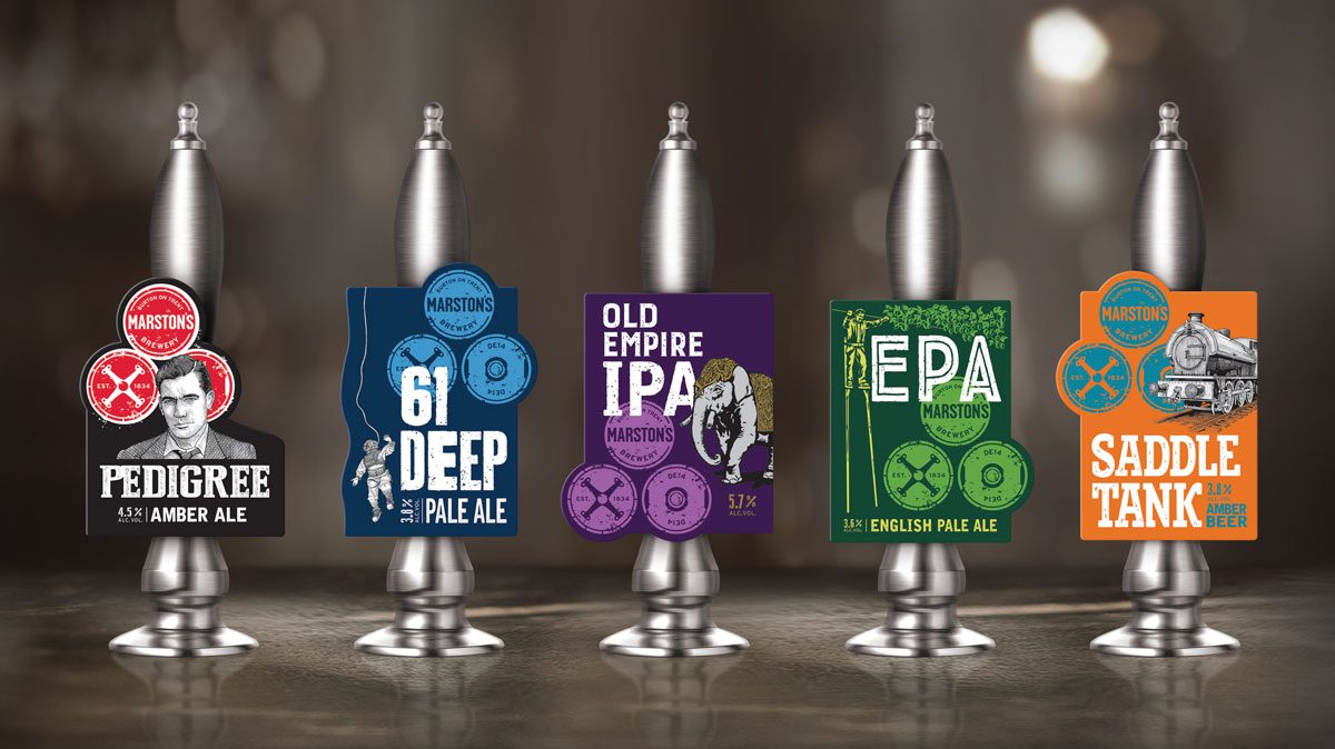
Marston's as a brewer had become too ‘beige’ and weren't resonating with the next generation of drinkers who are attracted to the vibrancy of the new 'craft' beer scene. We were briefed to fundamentally rejuvenate the Marston's brand identity and bring excitement and intrigue to younger drinkers, across packaging, pump clips and point of sale.
The solution
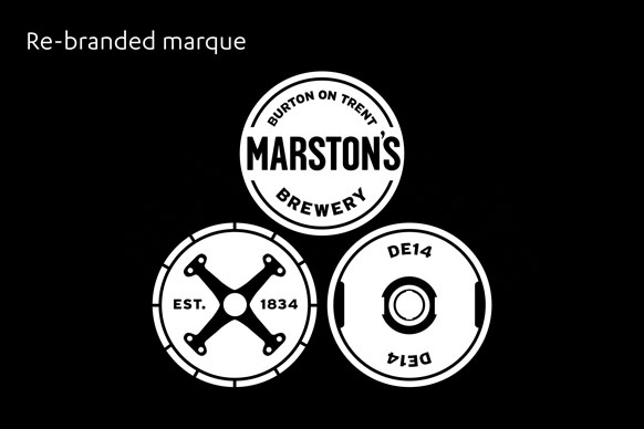
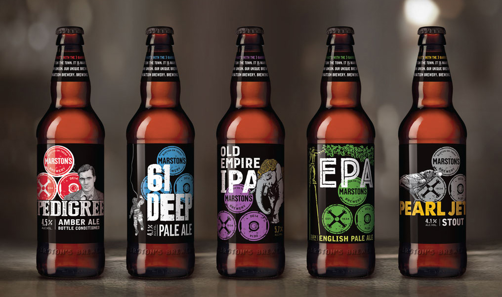
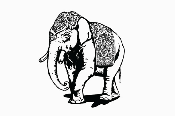
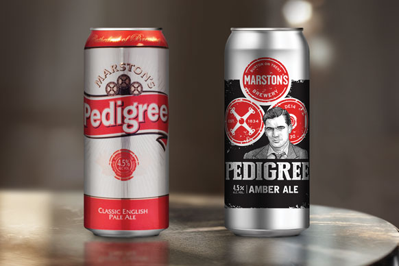
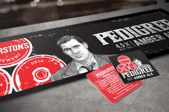
The new 3-barrel identity brings Burton, the 'home of brewing', to the fore, representing the heritage of their Burton Union brewing system combined with DE14, Marston's new innovation brewery, whose name is inspired by the brewery’s postcode. The bold new design for the core range of products brings a unique look across their whole portfolio, with illustrations that convey the story behind each product – such as 61 Deep, the depth of their well and 1950s brewer, George Peard, who named their iconic Pedigree amber ale.