F&C Investments. Bringing clarity to something that should be so simple.
- Information design
The challenge
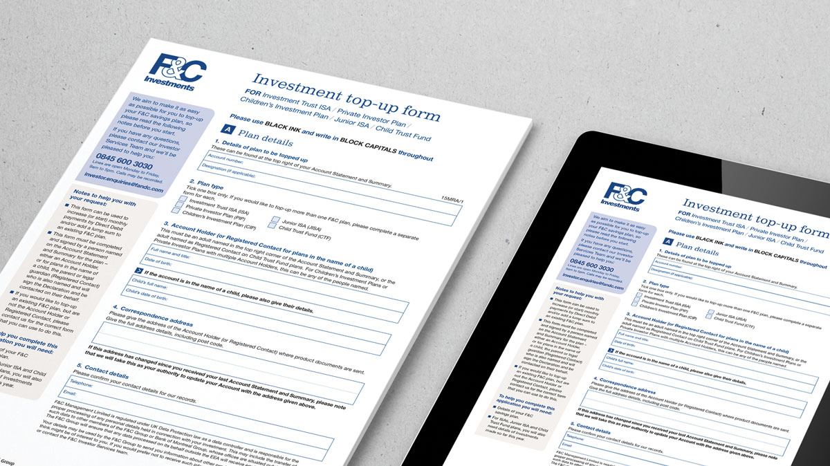
F&C required a 'revamp' of their investment top-up forms to improve the communication and strengthen the brand. Their multi-product top-up application form had recently been redesigned and, whereas it appeared to look clearer and more straightforward than before, there was still ambiguity around much of the communication.
The solution
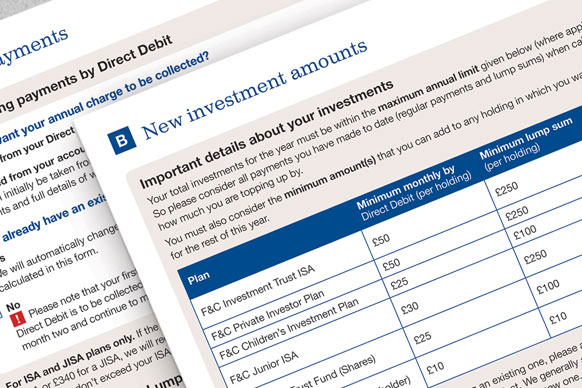
Whilst it is easy to assume that a 'one size fits all' approach would work for similar types of children's investment plans, the requirements of the form were surprisingly complex, since it covered multiple products with differing options for policy ownership, designated signatories, investment limits etc. We immersed ourselves in understanding the requirements of the different policies, individual investment restrictions and common queries raised when completing the existing form. The content of the form was streamlined and rationalised, adding routing and help notes to simplify the customer journey. Brand colours and type were used to bring the form in line with other marketing material, resulting in a document that quickly communicated a direct purpose to the customer as well as bringing consistency to the F&C brand.

“Too many organisations give prospective customers highly glossy pre-sales literature, but follow up with unusable, don’t-care after-sales documents. Given the ease with which customers can change suppliers, this is short-sighted and fails to grasp the opportunity to show that you care about clear communications…that you are technically advanced and that you are responsive.”
RHW Waller "Clearer communication in financial document design". Commissioned by Royal Mail, 1997
