Legal & General. Setting the standard for clear, intuitive financial application forms.
- Information Design
- Communication
The challenge
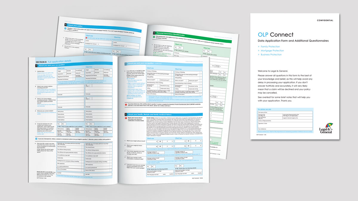
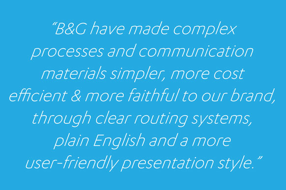
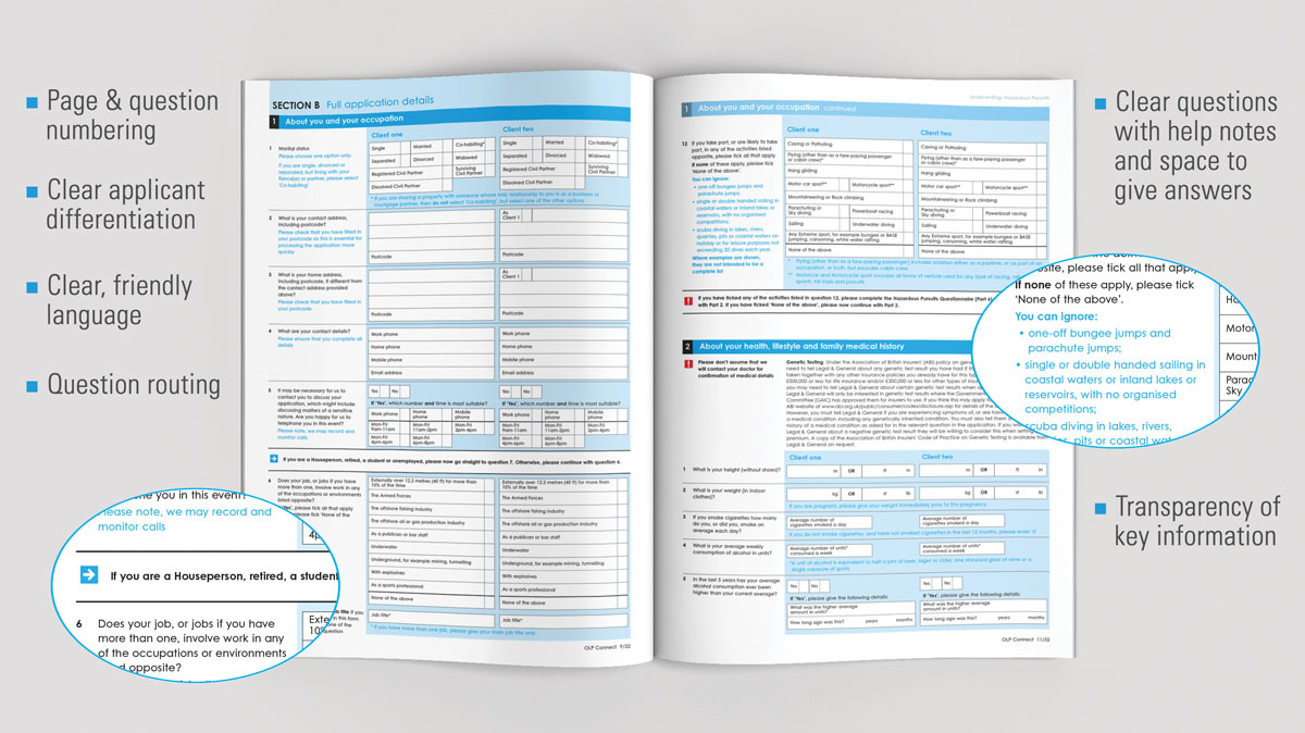
Legal & General commissioned us to review their suite of application forms and redesign them to improve quality, boost effectiveness and reinforce brand personality. Ultimately, they wanted to make forms quicker and easier to negotiate for all users, and help improve the customer experience.
The solution
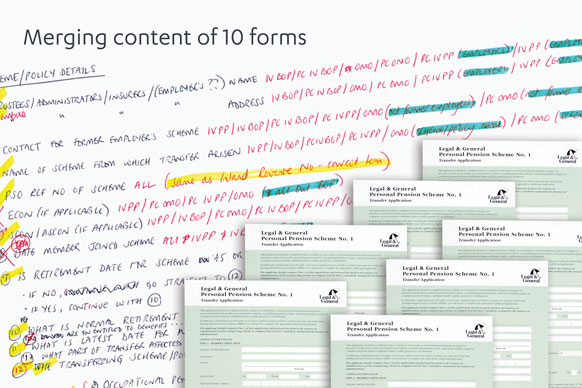
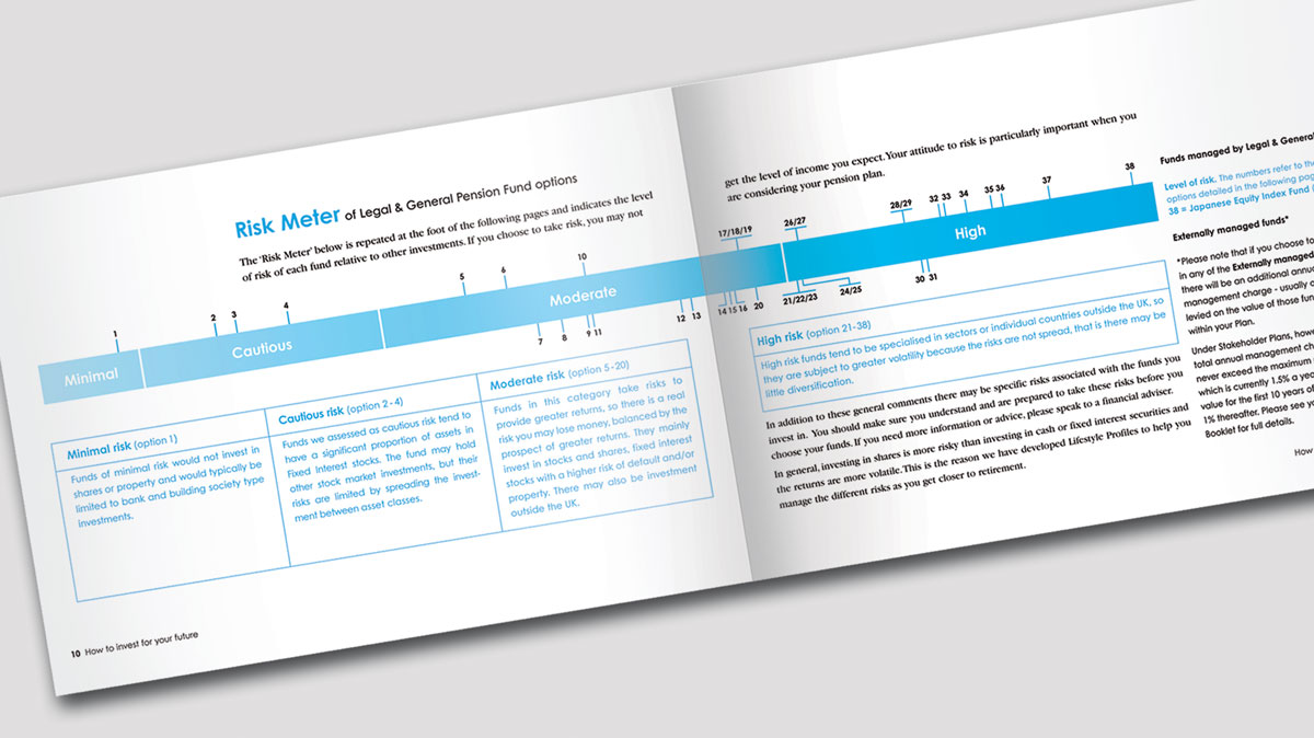
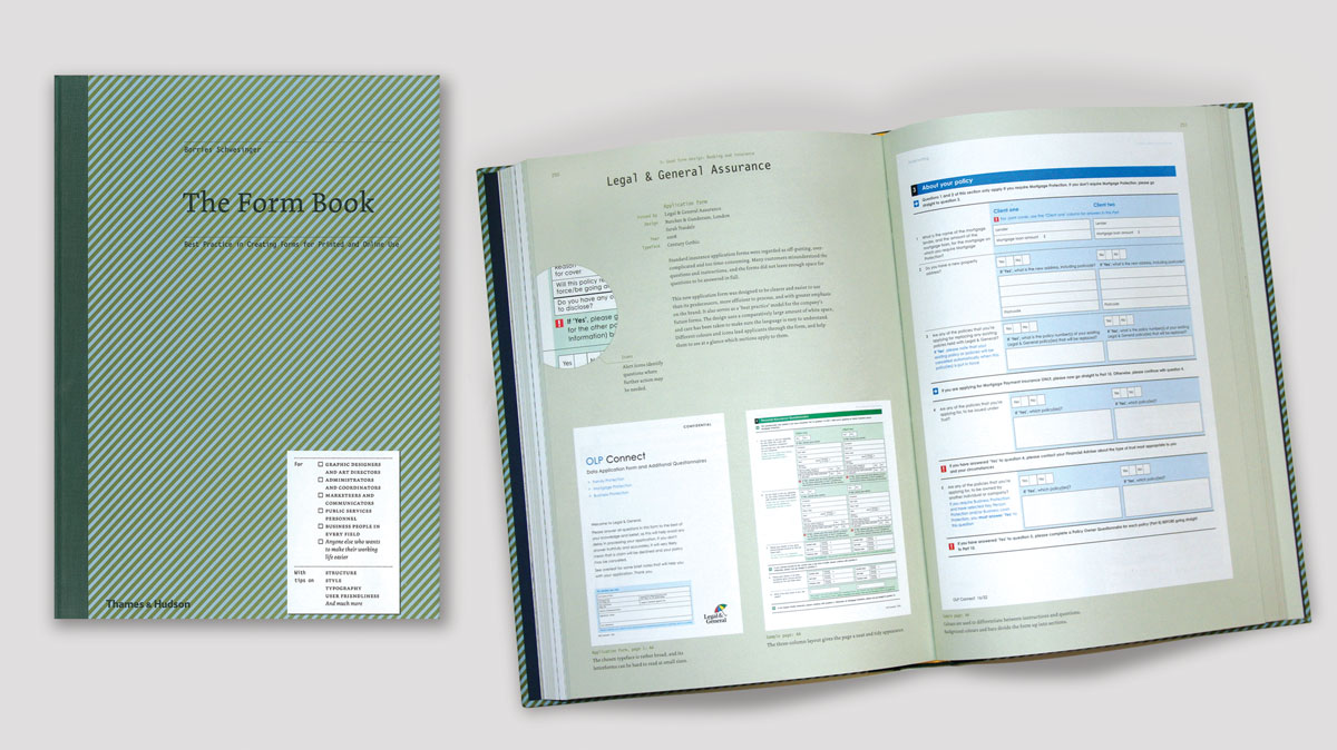
The initial focus was to improve the customer journey. Following an extensive audit and analysis of L&G's existing documents, as well as competitor material, the forms were re-structured and divided into sections, to establish a logical question flow. Routing was used to guide the applicant through the form as efficiently as possible, with the introduction of plain English, help notes and colour to improve navigation and ensure the accuracy of answers. Our work has also been published in the Thames and Hudson book on best practice for the design of forms!
