Potter’s Herbals. The perfect remedy.
- Branding
- Packaging
- Brand guidelines
The challenge
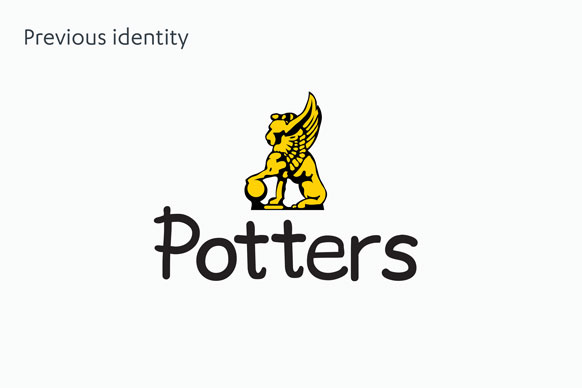
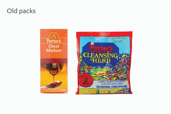
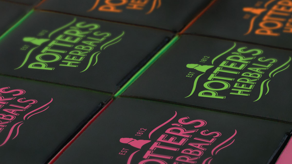
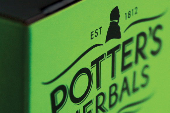
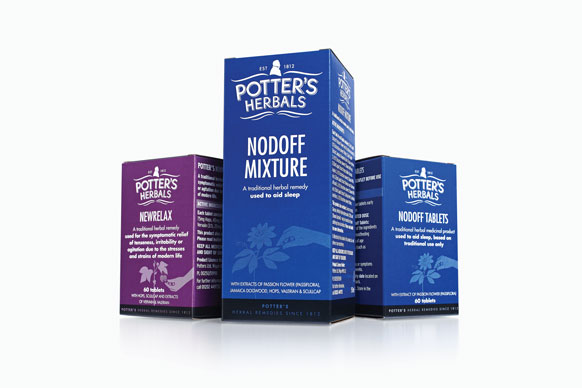
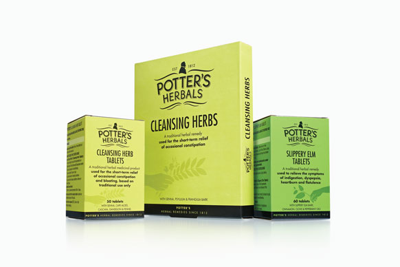
Potter’s Herbals is a company that has a history stretching back 200 years, but their branding lacked the gravitas and credibility to accurately portray this. Sales were in sharp decline and a new approach was required to persuade a new, younger audience about the relevance of the brand's herbal USPs and heritage.
The solution
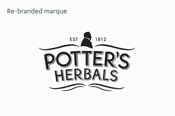
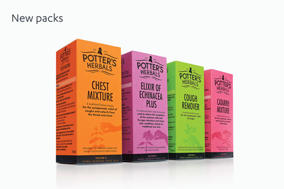
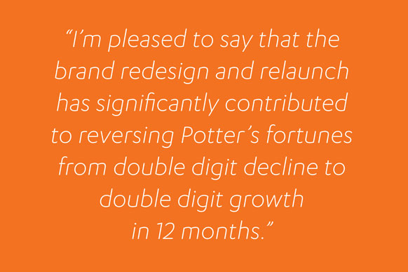
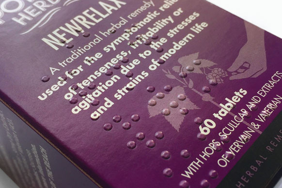
Through the creation of a new brand identity and a rethink of the range architecture, we injected clarity, modernity and energy into the brand, whilst reinforcing its heritage. The use of bright colours created strong shelf standout and benchmarked Potter’s Herbals as a design leader in their category. The result was award winning packaging, new listings with major retailers and a huge increase in sales…turning double digit decline into double digit growth.